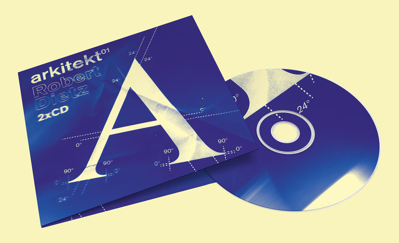
After designing a flyer for Geoff Oakes (Renaissance), he asked me to produce artwork for a new mix by house producer Robert Dietz.
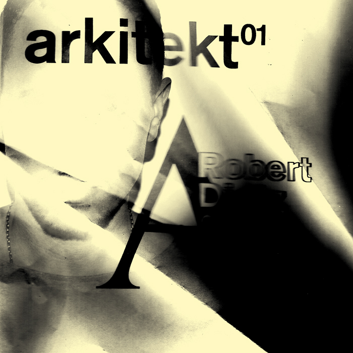
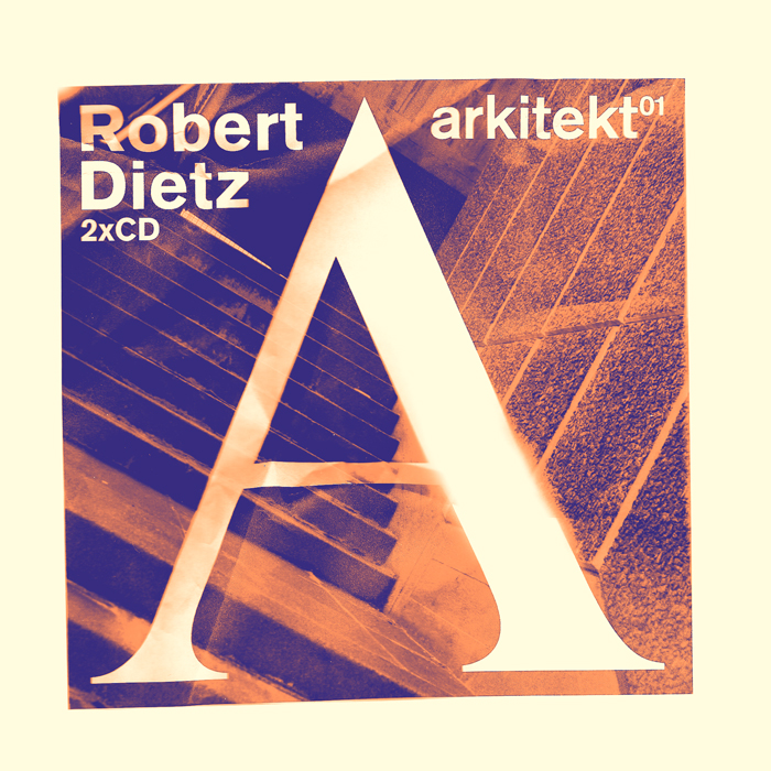
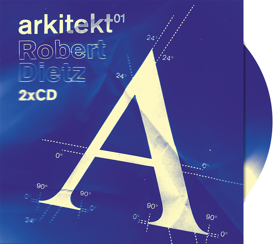
The large capital A in the centre was required, but I experimented with image-making and found an unusual effect could be achieved by crumpling paper in a photocopier, distorting the type that was printed onto it. This felt more true to the gritty, raw nature of many of the tracks.
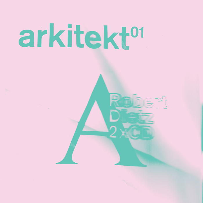
Trying out various colour schemes I then settled on blue and cream as it hinted at architectural blueprints, relevant I thought for the Arkitekt brand’s first release — laying out the blueprints for a new format. Unfortunately, the project did not go ahead in the end.
Some early experiments: